
We were assigned to design a website for a restaurant either fictional or established one. So, I wanted to design for a fictional pizza restaurant called Pizza Corner. So, I designed the logo in Illustrator & Photoshop and used it.
For this project, I did a lot of pre production work like doing 2 personas, skteches, style tile & SWOT analysis. I also did lot of research on different apps & similar apps that gave me some ideas. Some of the apps, I explored was Ikea, Wayfair. Also I made this project responsive for three different devices like a deskop, phone & a tablet keeping the similar layout in mind for all three.
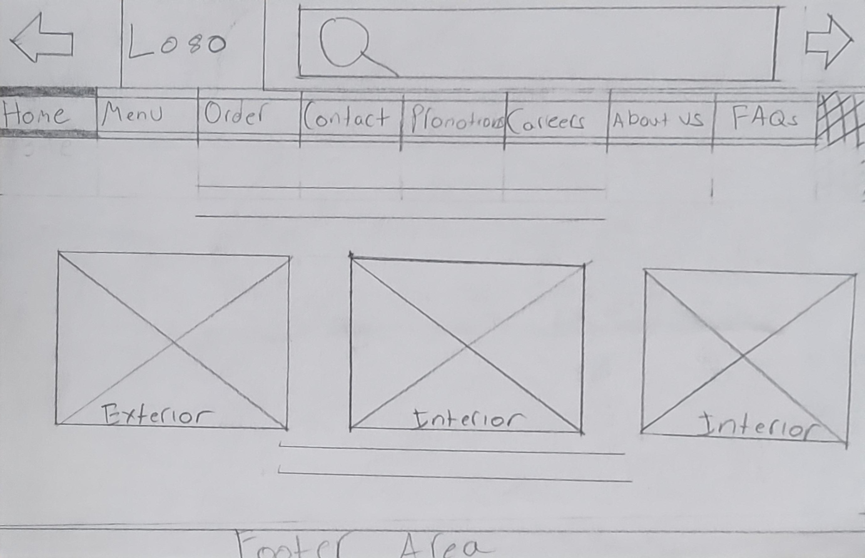
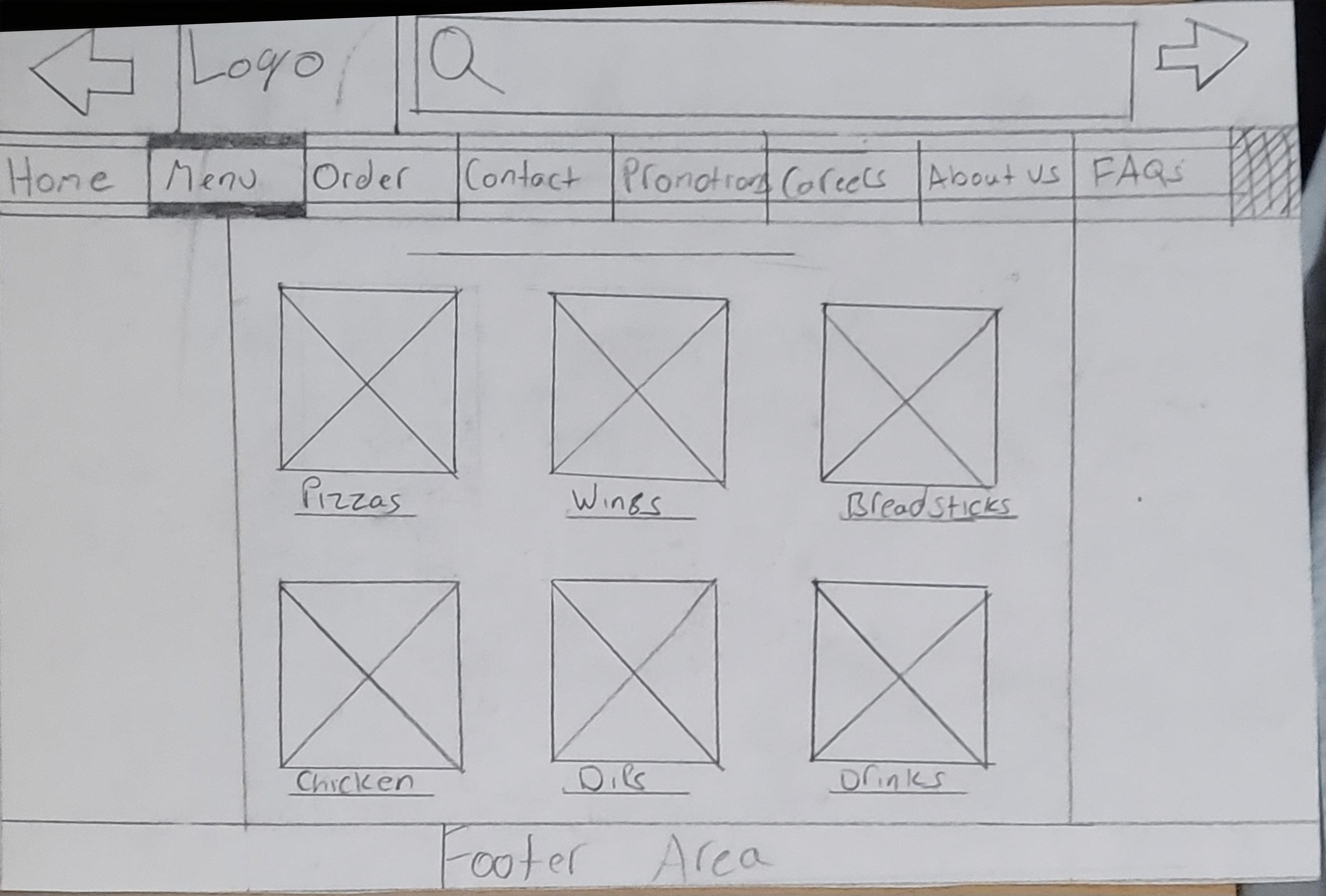
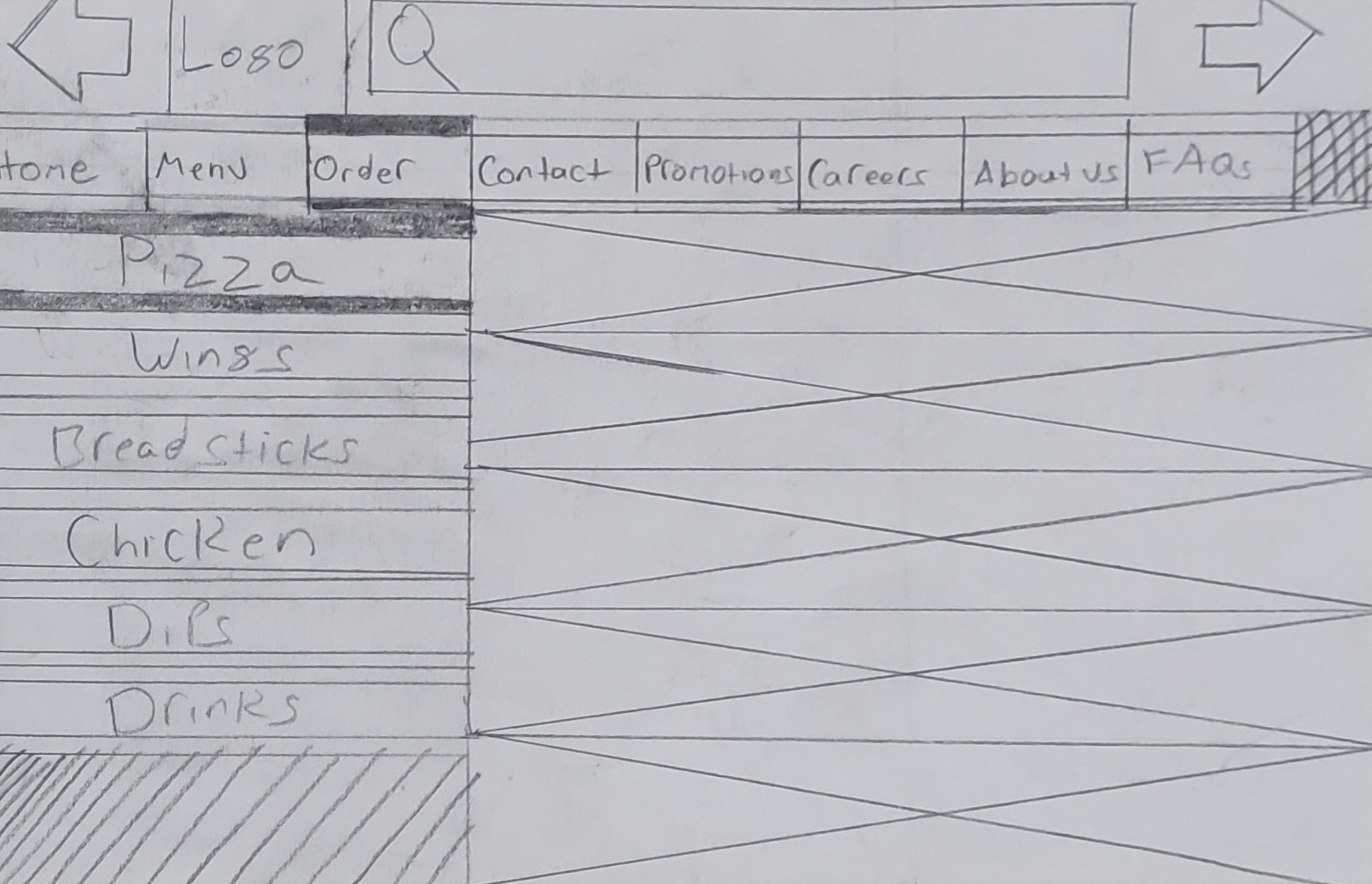
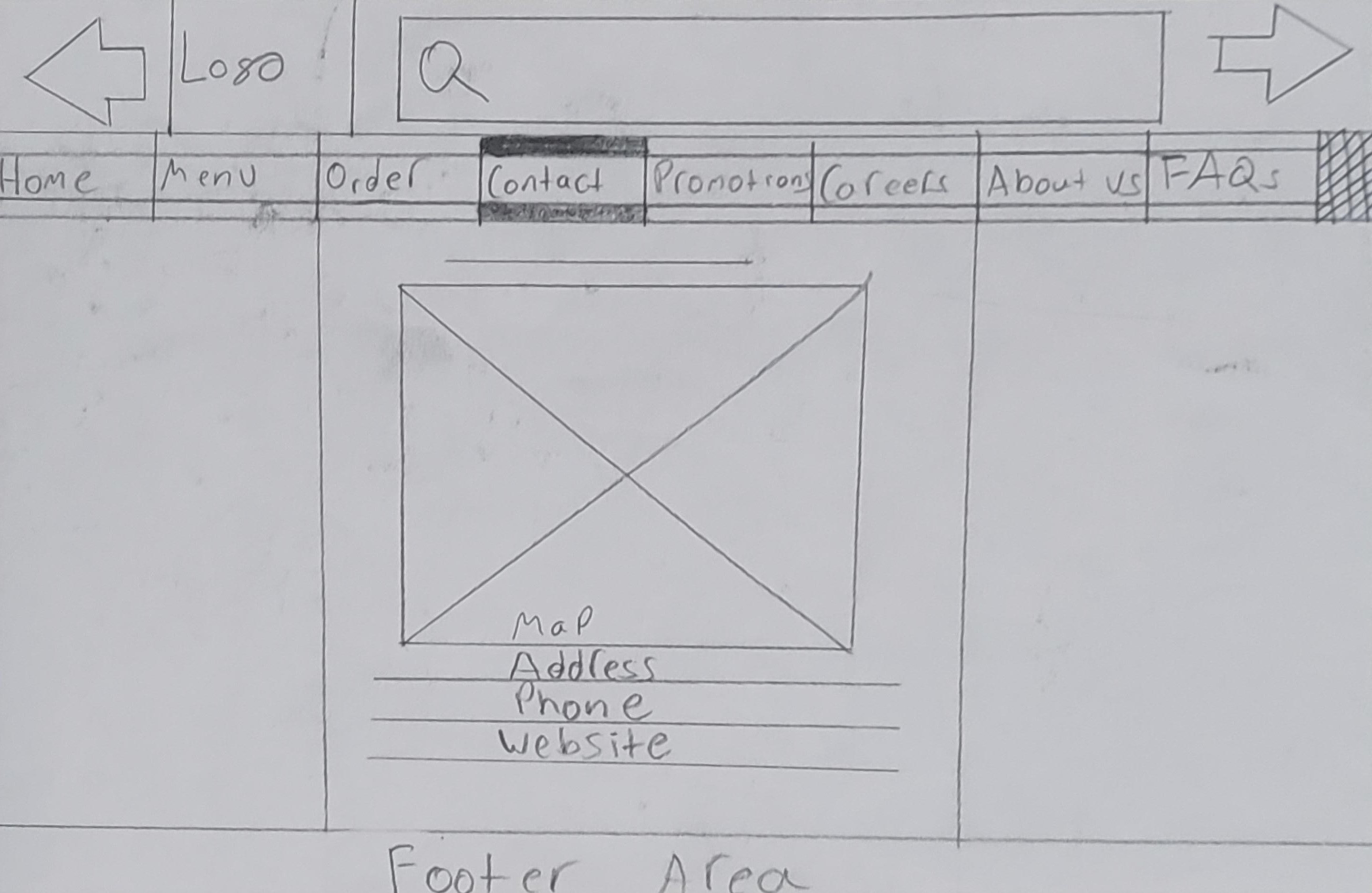
As you can see from the paper prototypes, I drew each page keeping in mind the scale of desktop and making sure where and how each elements will be placed properly to get a better layout. I also included the texts to show where the texts will be. I also did ketches for other pages as well, I was only able to add these for now.
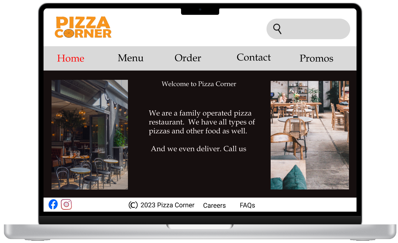
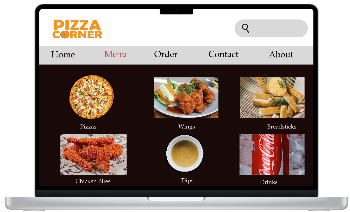
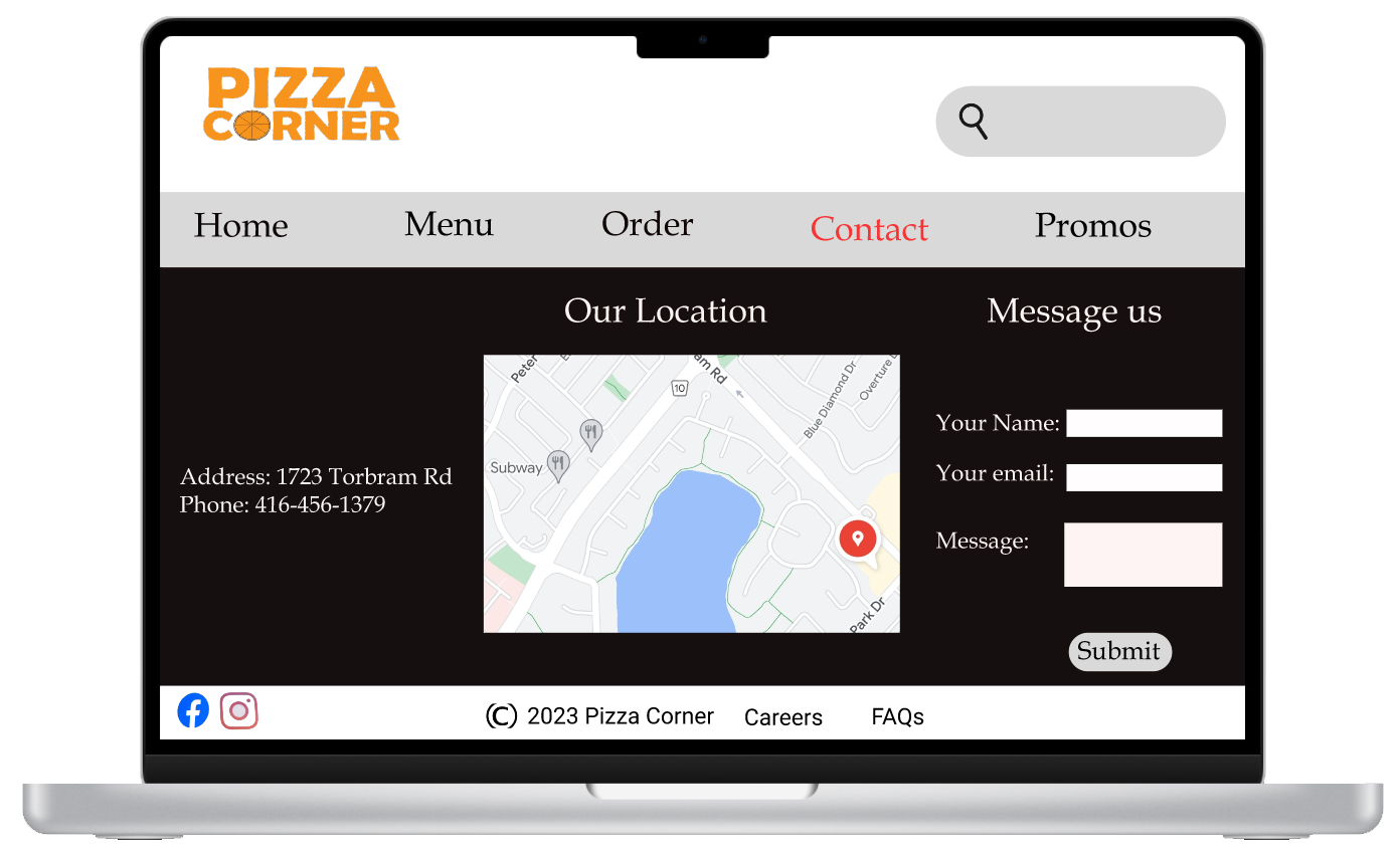
As you can see from the digital prototypes, I designed it as to how it would look when it's fully coded in the desktop. I used basic font of the navigation bar since, I didn't want to go over fancy with it. I chose to have black as a main background since, it would stand out and give it a feeling of a restaurant. I downloaded all of these free images from unsplash & pixabay. And I kep the navigation bar very simple to use. I also added a search bar at the top left of the corner to help wiht UX. And I think it worked well.
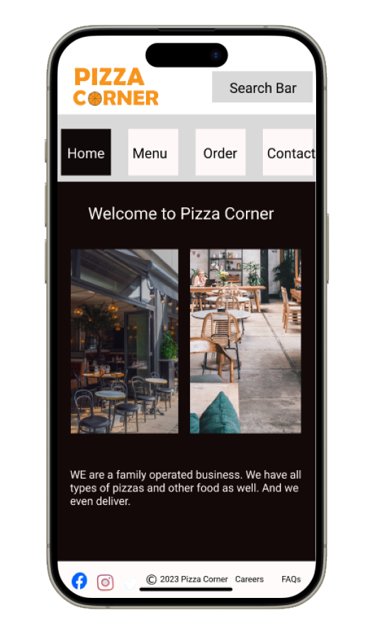
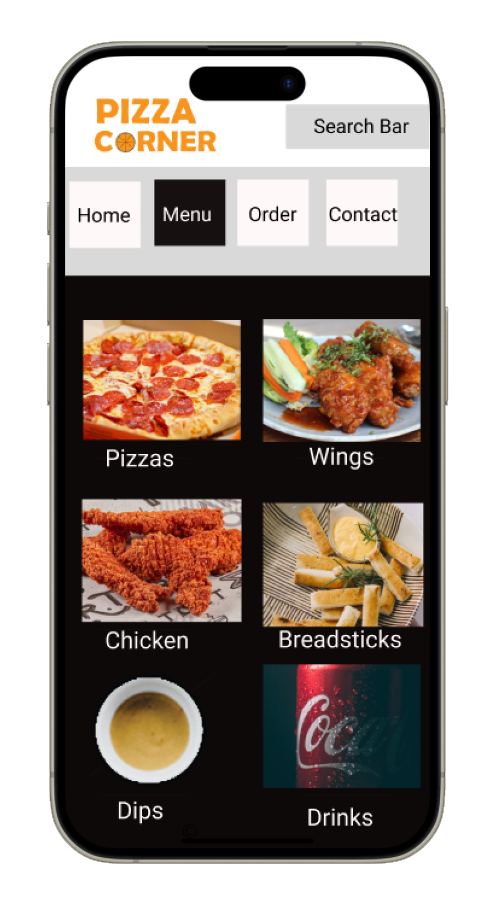
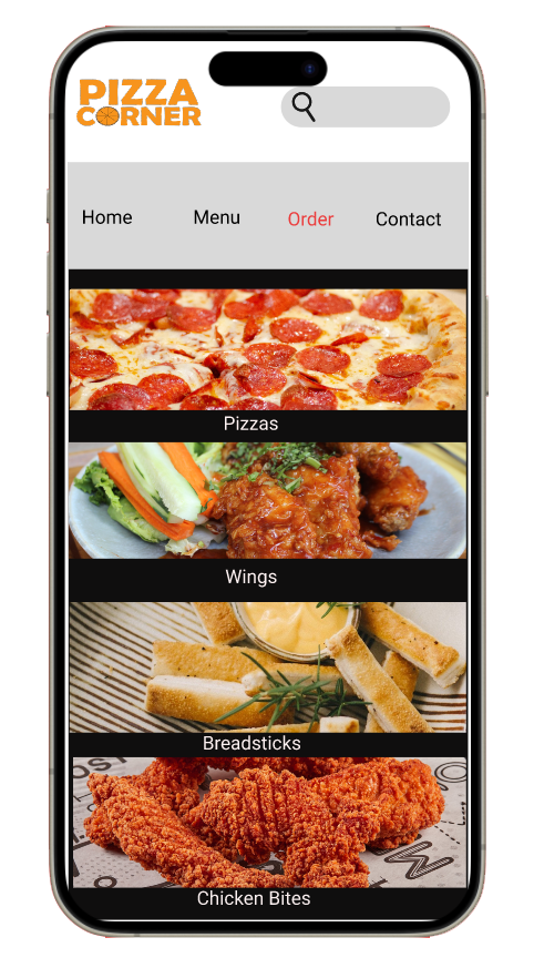
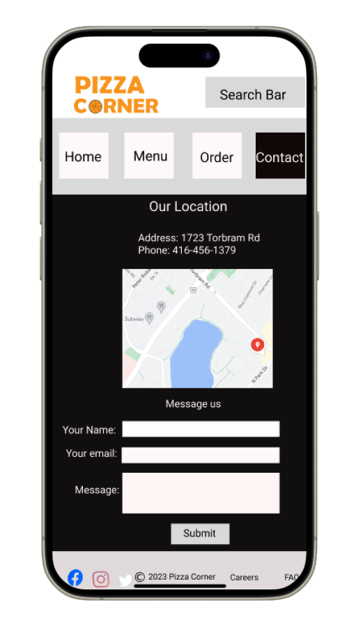
For the mobile, I removed a few things that were in desktop & tablet versions to make it fit. My design point for the mobile is to make it simpified with having lots of things showing. So, that the reason, I removed some of the things shown in desktop. I used same layout out witht the same images for the mobile as well, but changed the sizes a bit. I also added the scroll on this, so the users and get a feel on real site would look and feel.And also my main intent of this site is to have simple UX, so there are not confusions.